Hello, I am
Creative, dedicated and passionate about Design, Web, Marketing, Branding, Communication and Art.
imen
About me
I’ve been fascinated with the way people interact with technology since forever.
I’m passionate about Design, UX, Branding, Marketing and Art.
I enjoy creating user-centric, fun & colorful human experiences.
I have an eye for detail and a curiosity about how things are constructed, both in a physical and digital space.
When I'm not trying to conquer the world by pixel, you'll likely find me watching dystopian TV shows, thrifting or sipping coffee at local shops.
Shopping App Design
Project overview
The product:
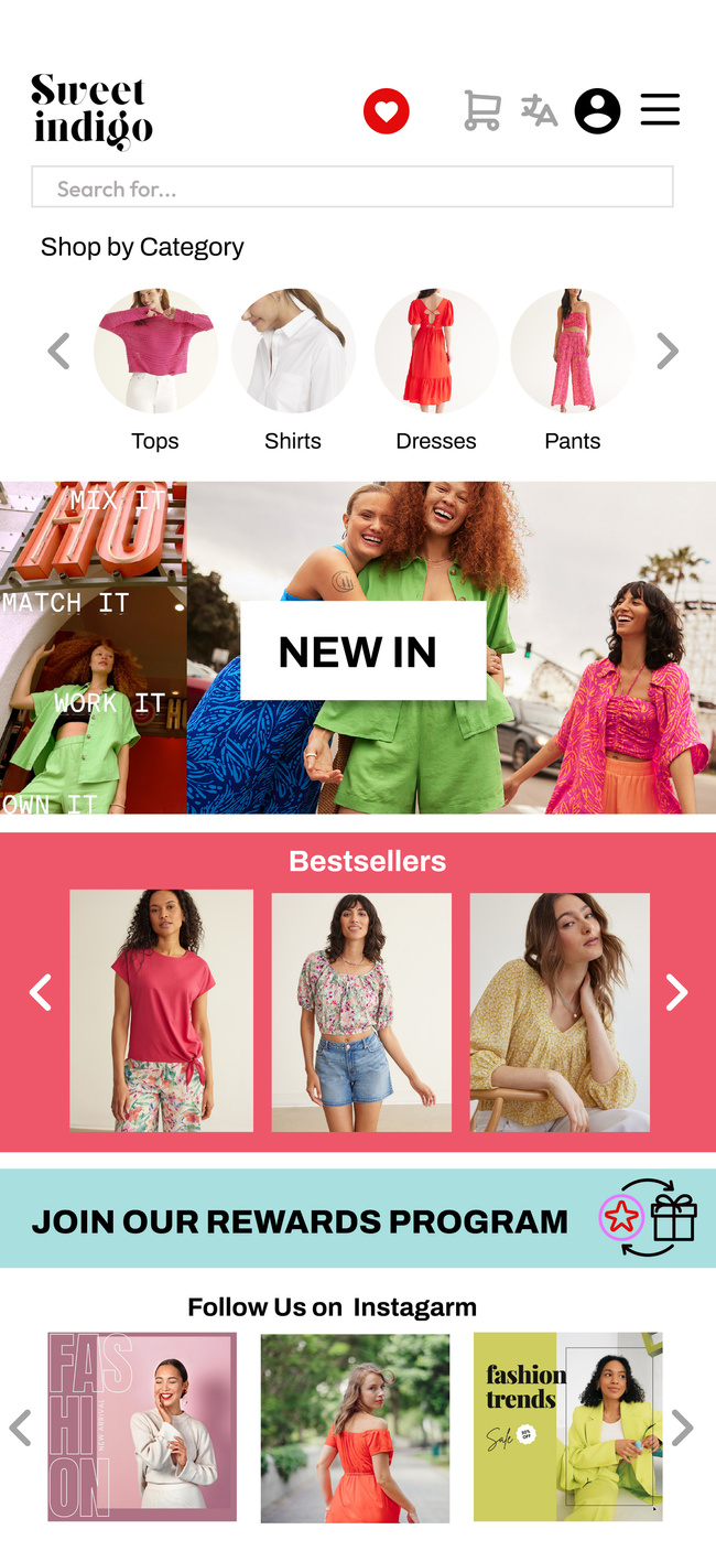
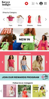
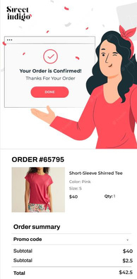
Sweet indigo is an online shop located in France. Sweet indigo strives to deliver fashionable clothes for women all around the world. They offer a wide selection of clothes at competitive pricing. Sweet indigo targets customers like working women and busy young moms who lack the time or ability to go shopping.
Project duration:
June 2023 to October 2023.
The problem:
Working women and busy mothers lack the time necessary to go shopping.
The goal:
Design an app for Sweet indigo that allows users to easily order and get delivered, fashionable clothes for women.
My role:
UX designer designing an app for Sweet indigo from conception to delivery.
Responsibilities:
Conducting interviews, paper and digital wireframing, low and high-fidelity prototyping, conducting usability studies, accounting for accessibility, and iterating on designs.
Understanding the user
● ● ●
●
User research
Personas
Problem statements
User journey maps
User research: summary
I conducted interviews and created empathy maps to understand the users I’m designing for and their needs. A primary user group identified through research was working adults who don’t have time to shop in person.
This user group confirmed initial assumptions about Sweet indigo customers, but research also revealed that time was not the only factor limiting users from shopping in person. Other user problems included obligations, interests, or challenges that make it difficult to buy clothes in-person.
User research: pain points
1
Time
Working women and young moms are too busy to spend time on shopping in person
2
Accessibility
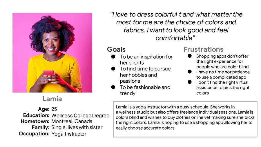
Platforms for ordering clothes are not equipped with assistive technologies
3
Language
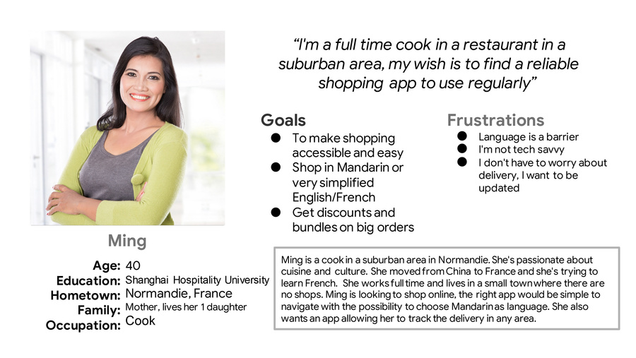
The experience can be challenging if no multi language support isn't provided

Personas
User journey map
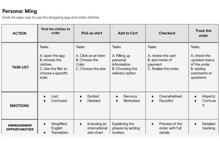
Mapping Ming’s user journey revealed how helpful it would be for users to have access to a dedicated Sweet indigo app.
Starting the design
● ● ●
●
● ● ●
●
Paper wireframes
Digital wireframes
Low-fidelity prototype
Usability studies
Paper wireframes
Taking the time to draft iterations of each screen of the app on paper ensured that the elements that made it to digital wireframes would be well-suited to address user pain points. For the home screen, I prioritized a quick and easy ordering process to help users save time.
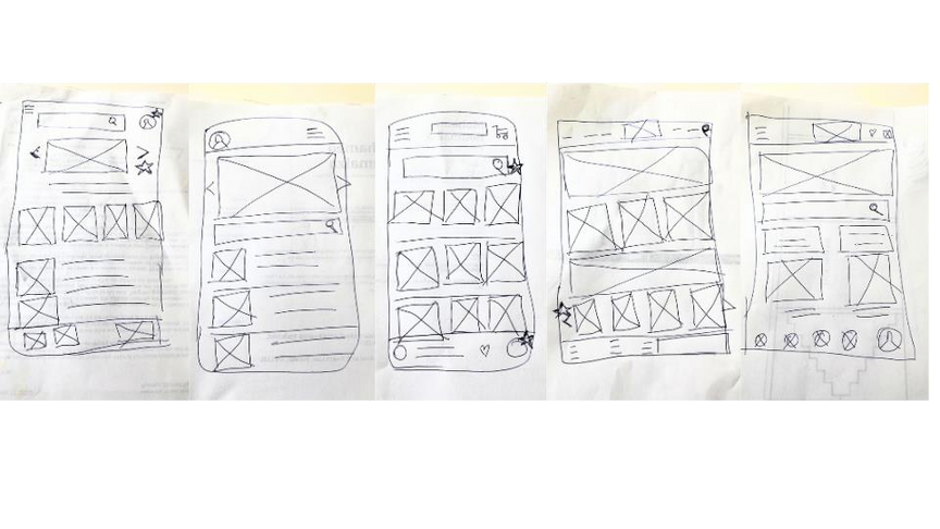
Stars were used to mark the elements of each sketch that would be used in the initial digital wireframes.
Digital wireframes
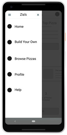
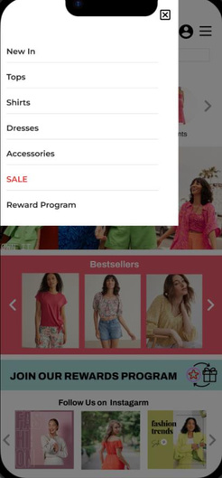
Easy navigation was a key user need to address in the designs in addition to equipping the app to work with assistive technologies.
Easy access to navigation that’s screen
reader friendly.
Low-fidelity prototype
Using the completed set of digital wireframes, I created a low- fidelity prototype. The primary user flow I connected was building and ordering clothes so the prototype could be used in a usability study.
View the Sweet indigo app
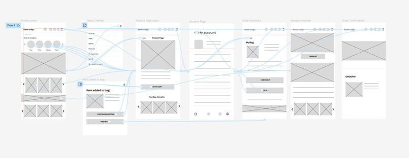
Usability study: findings
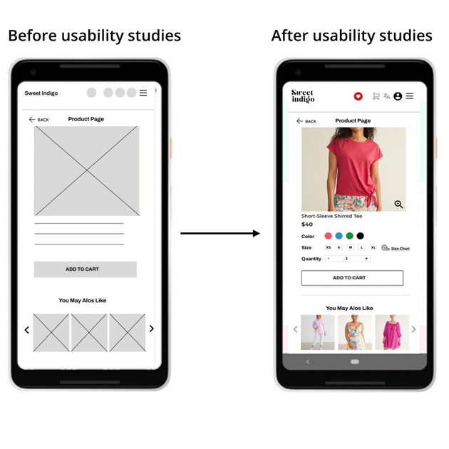
I conducted two rounds of usability studies. Findings from the first study helped guide the designs from wireframes to mockups. The second study used a high-fidelity prototype and revealed what aspects of the mockups needed refining.
Round 1 findings
1
Users want to order clothes quickly
2
Users want more features/filers
3
Users want to choose thesize with a size chart table
Round 2 findings
1
The checkout isn't clear/complete
2
Make the buttons/text more accessible
Refining the design
●
Mockups
●
High-fidelity
●
Accessibility
Mockups
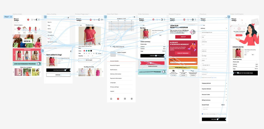
Early designs allowed for some customization, but after the usability studies, I added additional options to choose the right size & colour. I also revised the design so users see all the customization options in the product page
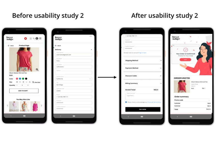
The second usability study revealed frustration with the checkout flow. to streamline this flow, I consolidated the “Current order” and “Checkout screens” to one “Order summary” screen. I also added the pickup or delivery option to this screen.
Key mockups
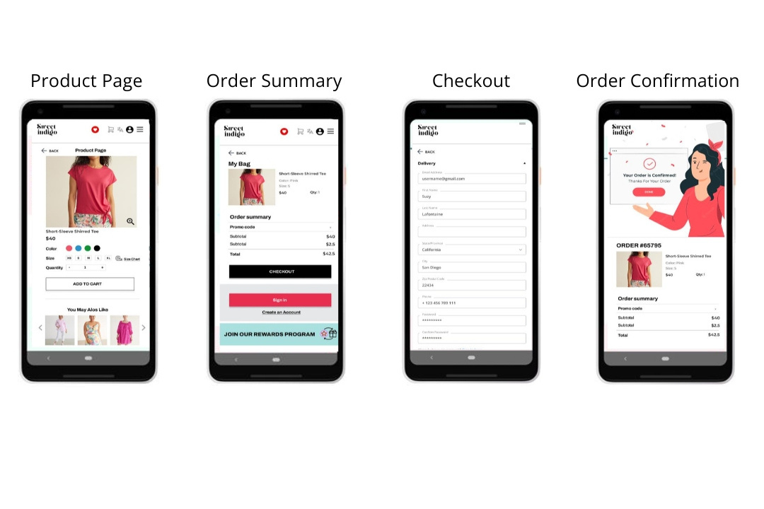
High-fidelity prototype
The final high-fidelity prototype presented cleaner user flows for ordering an item and checkout. It also met user needs for a pickup or delivery option as well as more customization.
View the Sweet indigo app
Accessibility considerations
1
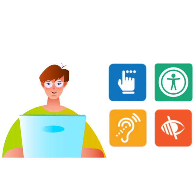
Provided access to users who are vision impaired through adding alt text to images for screen readers
2
Used icons to help make navigation easier
3
Used detailed imagery to help all users better understand the designs
Healthy Me App
Project overview
The project:
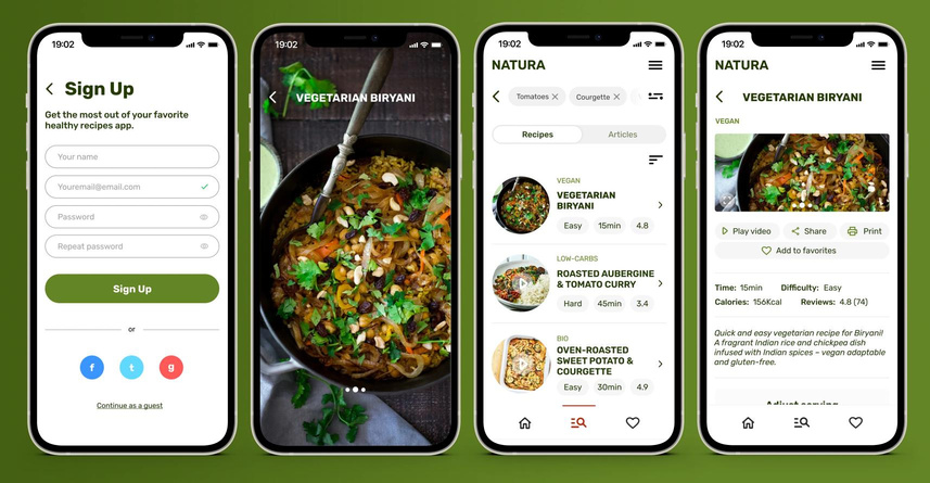
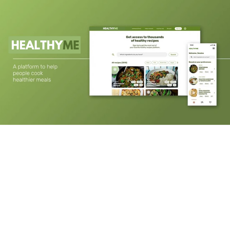
‘HEALTHY ME’ is a cross-platform product developed for social good. The project considers a progressive enhancement approach that consists of designing a dedicated app and a responsive website. Main responsibilities were conducting interviews, developing paper and digital wireframes, low and high-fidelity prototypes, conducting usability studies, accounting for accessibility, and iterating on designs.
Project duration:
September 2023 to October 2023.
The problem:
Busy adult workers do not want to spend a lot of time searching for healthy recipes and need to quickly find meal options online that enable them to stay healthy.
The goal:
‘HEALTHY ME’s platform design allows users to quickly check for healthy recipes on their desktop computer, on their phone with a responsive website or dedicated app that offers extra features.
My role:
UX designer designing an app for HEALTHY ME from conception to delivery.
Responsibilities:
Conducting interviews, paper and digital wireframing, low and high-fidelity prototyping, conducting usability studies, accounting for accessibility, and iterating on designs.
Understanding the user
● ● ●
●
User research
Personas
Problem statements
User journey maps
User research: summary
I conducted interviews and created empathy maps to understand the users I’m designing for and their needs. A primary user group identified through research was working adults who want to save some time searching for recipes to enjoy a healthy meal.
This user group confirmed initial assumptions about HEALTHY ME customers, but research also revealed that some find some websites hard to use and want to have quick access to basic recipes information.
User research: pain points
1
Limited info
Some websites don’t share some important information about the recipes
2
Accessibility
Similar types of products are often hard to use and some offer a frustrating overall experience
3
Features
The experience can be challenging there are no enough filters

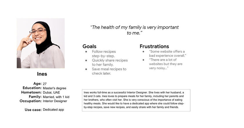
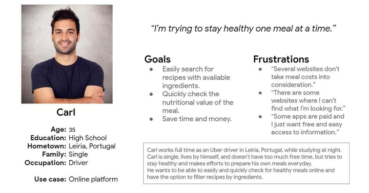
Personas
User journey map
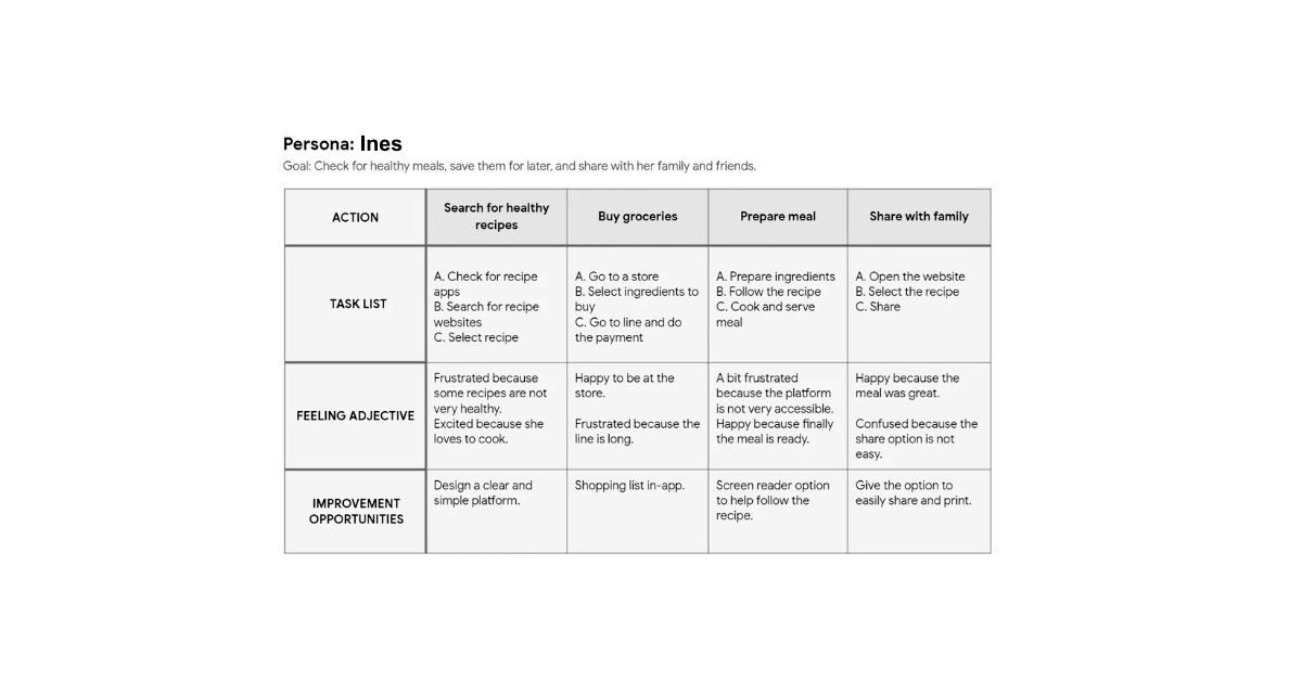
Mapping Ines’s user journey revealed how beneficial would be to have a clear and simple dedicated app with a shopping list in-app and to easily share and print recipes.
Starting the design
● ● ●
●
● ● ●
●
Paper wireframes
Digital wireframes
Low-fidelity prototype
Usability studies
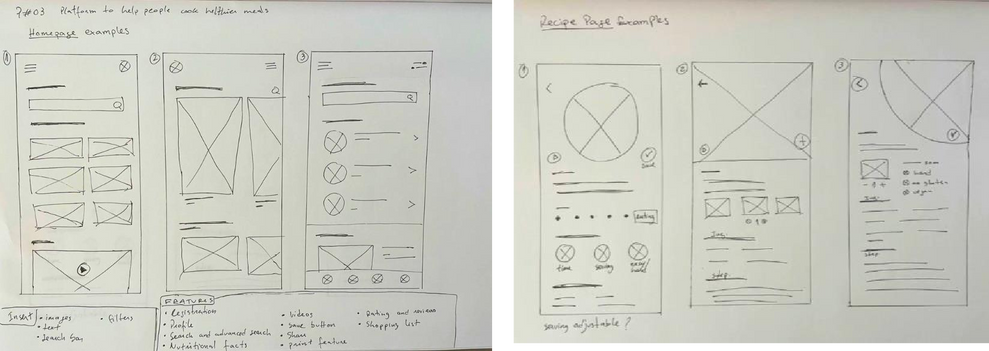
Paper wireframes
Taking the time to draft iterations of some of the screens of the app on paper ensured that the elements that made it to digital wireframes would be well-suited to address the user’s
pain points. For example, on the homepage, I prioritized the option to search as well as recommendations based on users’ preferences.
Digital wireframes
Early designs allowed users to quickly use the search bar and check some recommendations based on preferences. After usability studies,
was found that users wanted a more intuitive navigation system, so I added a navigation bar, and the hamburger menu was relocated to the right side for accessibility matters.
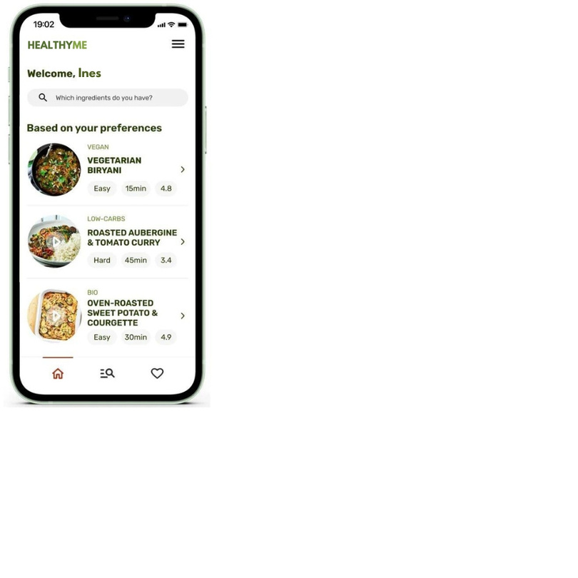
quickly use the search bar and check some recommendations
Low-fidelity prototype
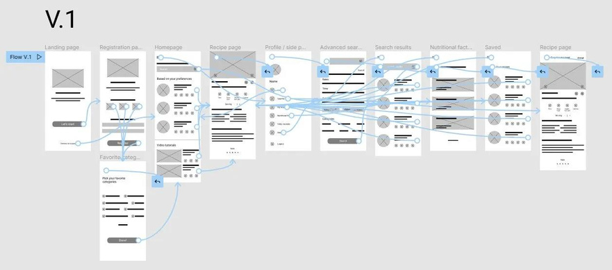
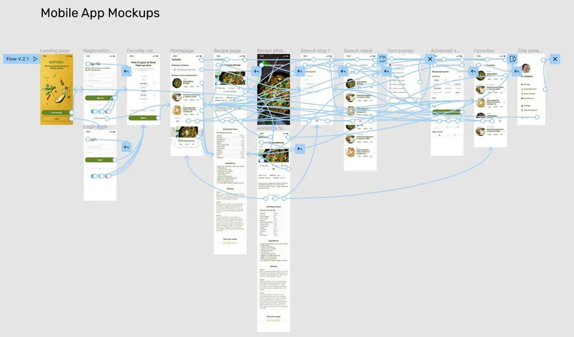
This lo-fi prototype connects the user flow of searching for recipes, checking the recipe step-by-step, and more.
Usability study: findings
I conducted two rounds of usability studies. Findings from the first study helped guide the designs from wireframes to mockups. The second study used a high-fidelity prototype and revealed what aspects of the mockups needed refining.
Round 1 findings
1
Users want an option to filter searches using types of meals
2
Users want a better way of navigating through the app
Round 2 findings
1
Users wanted a more intuitive navigation system, so I added a navigation bar
2
The hamburger menu was relocated to the right side for accessibility matters
Refining the design
●
Mockups
●
High-fidelity
●
Accessibility
Mockups
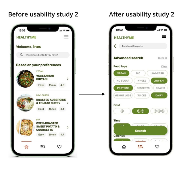
Early designs allowed users to quickly use the search bar and check some recommendations based on preferences. After
usability studies, was found that users wanted a more intuitive navigation system, so I added a navigation bar, and the hamburger menu was relocated to the right side for accessibility matters.
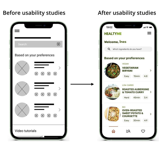
The second usability study revealed early designs did not consider the option to use food type in the advanced search system. In the first usability study, the lack of this option made some users frustrated. To resolve the issue, I added the option to search by food type, as well as an overall redesign, and an easier-to-use search system with clear labeling and simple iconography.
Key mockups
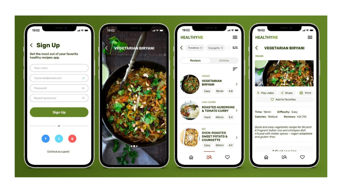
High-fidelity prototype
The final high-fidelity prototype presented a clear, simple, and easy-to-use design.
Accessibility considerations
1
Simple and clear iconography to improve navigation
2
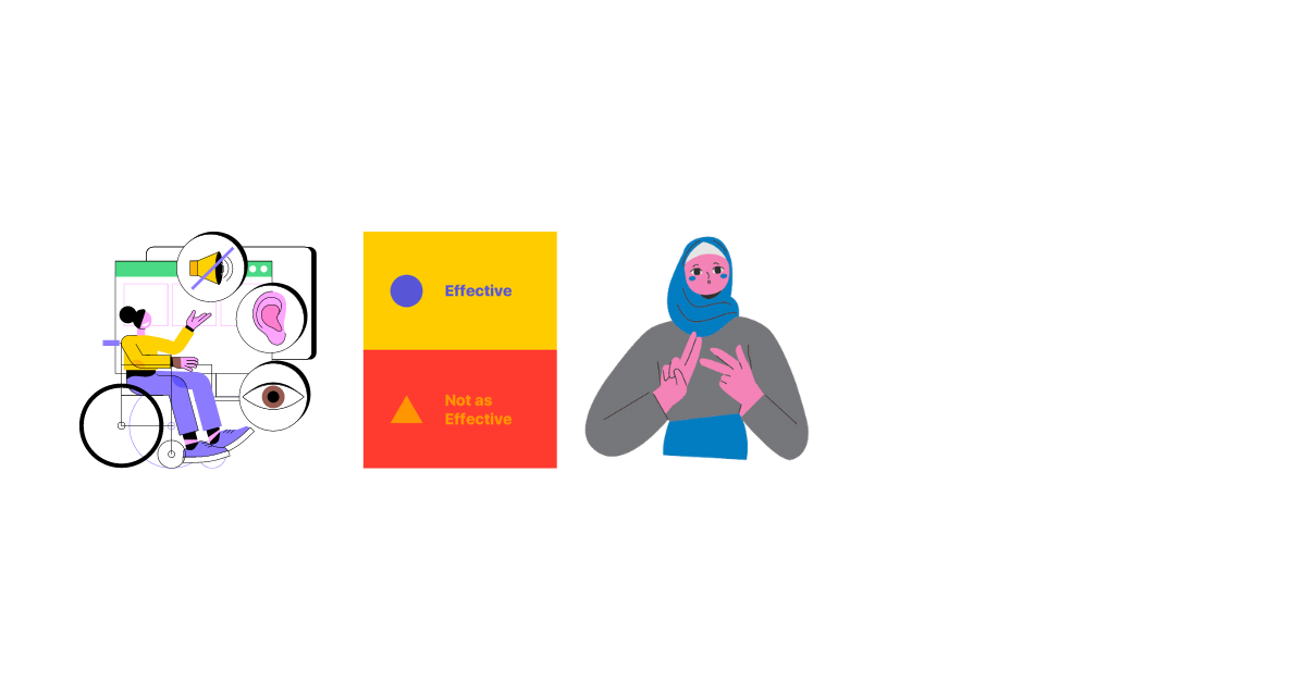
The color palette is a11y, enabling people with visual impairments or color vision disabilities to have a good experience
3
All pages have clickable elements and the app can be used without motion option available
Art Gallery Tour App for Families
Project overview
The project:
‘Elysian’ is a fictional art gallery in Paris, France. It features many rooms of International art, and exploring the gallery without a guide can feel overwhelming, especially for families with children. I designed an app that provides a way for visitors to create a custom tour that fits their schedule and interests.

G
E
Elysian
Project duration:
September 2023 to October 2023.
The problem:
Visitors to the Elysian Gallery are often tourists who are constrained by tight schedules, as well as by the interests and attention spans of the youngest members of their group. Visitors may also feel overwhelmed by the size of the gallery, and may not know where to start or how to proceed through the galleries.
The goal:
To create a virtual tour app that allows visitors to customize a tour based on their group’s needs.
My role:
UX designer designing an app for ‘Elysian’ from conception to delivery.
Responsibilities:
End to end research and design, including: user research, ideation, wireframing, low and high-fidelity prototyping, usability studies, iterating on designs.
Understanding the user
● ● ●
●
User research
Personas
Problem statements
User journey maps
User research: summary
I conducted interviews and created user personas in order to identify the different kinds of people who go to art galleries. One consistent kind of user I found was someone who visited galleries while on vacation.
Before conducting this research, I imagined the average gallery-goer as someone who had an education in art, and lived close to galleries that they visited often. While this assumption proved true for some users, I originally didn’t think to consider someone who only goes to galleries as a tourist, but this turned out to be a significant demographic.
User research: pain points
1
Limited Time
Travelers often have tight itineraries, they want to know where to go in the gallery to get the most out of their visit
2
Lack of Engagement
Creating interest and keeping the kids engaged is challenging
3
Features
Learning boring facts about artworks and artists isn’t interesting.
Personas
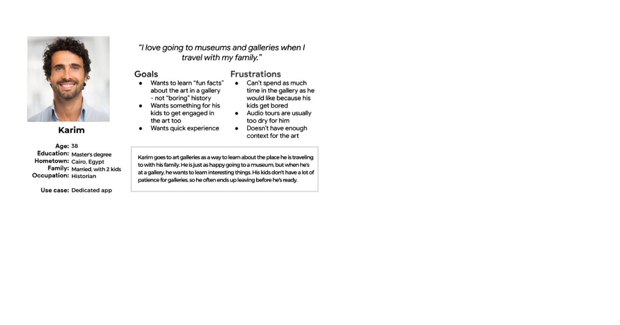
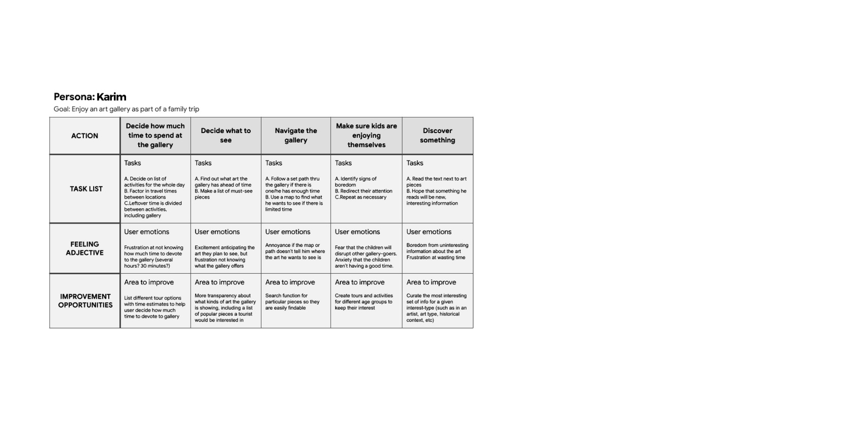
Problem Statement: Karim is a tourist on vacation with his family who needs a way to enjoy an art gallery quickly because his time and his family’s attention span are limited.
User journey map
Mapping Karim’s user journey revealed how beneficial would be to have a clear and simple dedicated app to navigate the galley and make sure the kids are enjoying the activity.
Starting the design
● ● ●
●
● ● ●
●
Paper wireframes
Digital wireframes
Low-fidelity prototype
Usability studies
Paper wireframes
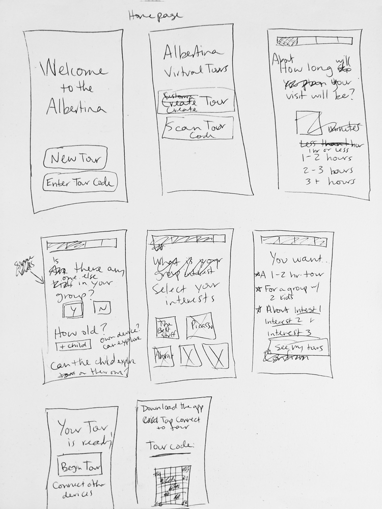
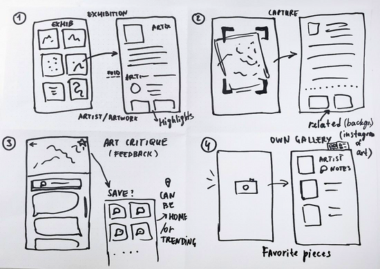
Taking the time to draft iterations of some of the screens of the app on paper ensured that the elements that made it to digital wireframes would be well-suited to address the user’s
pain points. For example, on the homepage, I prioritized the option to search as well as recommendations based on users’ preferences.
Digital wireframes
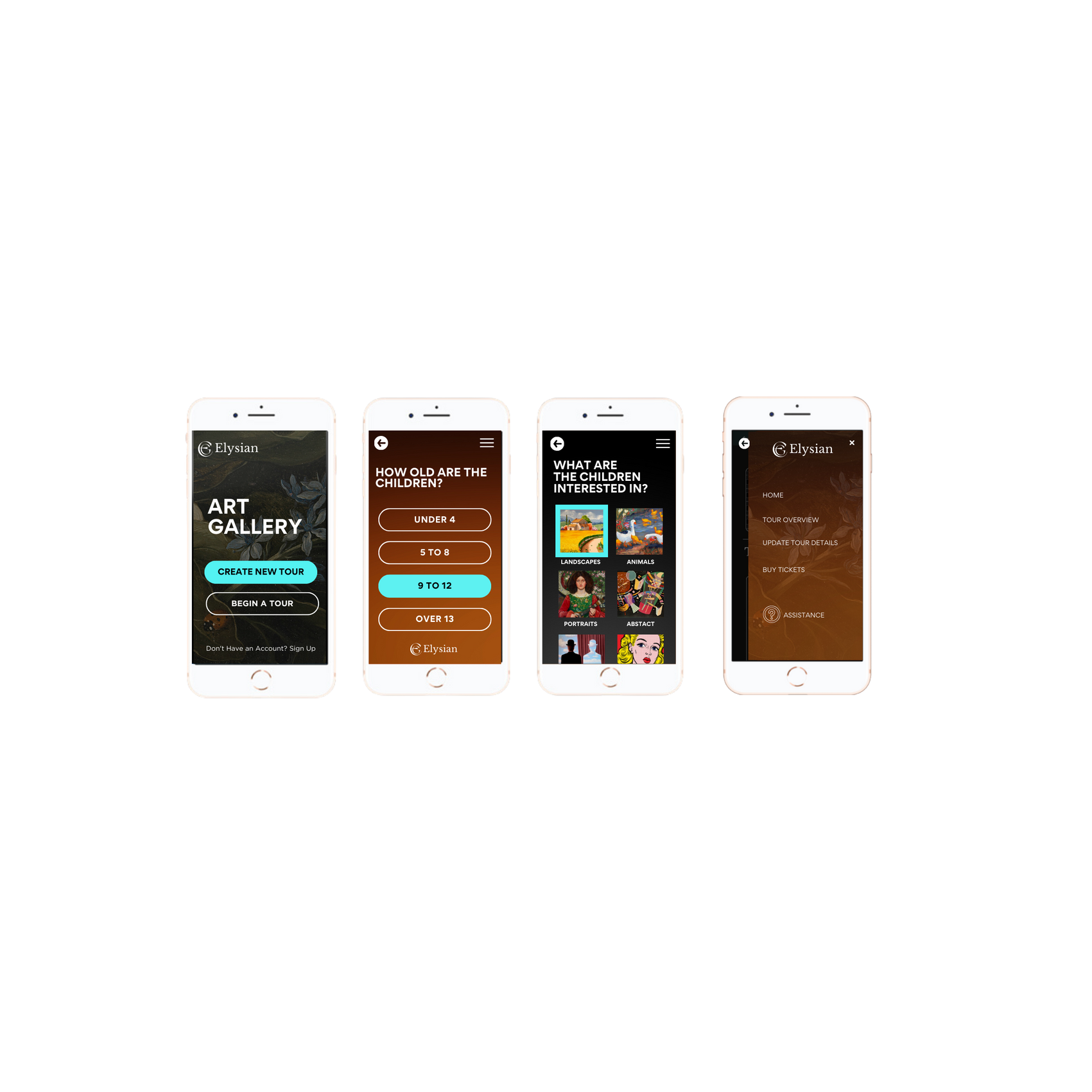
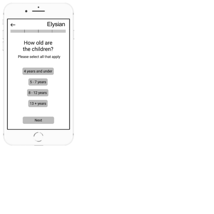
I wanted the tour creation experience to feel easy, and have a clear beginning and end. Because I narrowed the customization down to only three factors (duration, children, and interests), I chose to display one question per screen, with a progress bar reflecting where the user is in the tour creation journey.
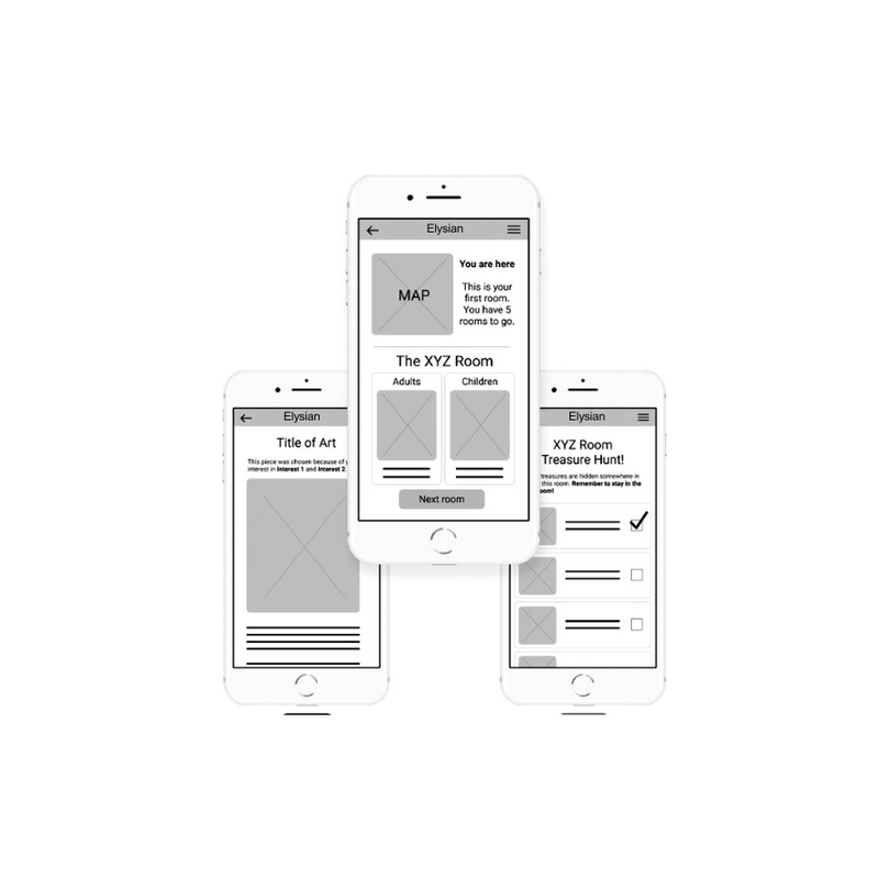
The tour itself needed to accommodate both adults and children, as well as groups whose members didn’t all have a device to view the tour. In this group of screens, we can see that one device can have access to both the adult and child versions, and is able to switch between the two.
Low-fidelity prototype
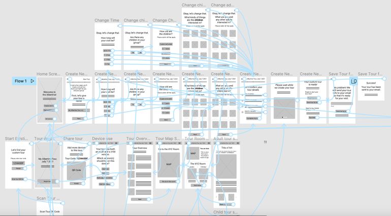
The low-fidelity prototype allows the user to simulate creating a tour, and then taking the tour as an adult with a child also using the same device. This is the first iteration before user testing.
Usability study: findings
I conducted two rounds of usability studies. Findings from the first study helped guide the designs from wireframes to mockups. The second study used a high-fidelity prototype and revealed what aspects of the mockups needed refining.
Round 1 findings
1
Users wanted to control which version of their group’s tour they saw
2
Users didn’t understand how to use the QR code feature
3
Users didn’t understand what to do to access their tour
Round 2 findings
1
Users wanted to be able to go to a previous room in the tour
2
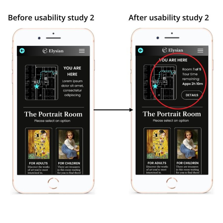
Users wanted more info about how much time/art/rooms were left in the tour
3
Users wanted to use the progress bar as navigation during tour creation
Refining the design
●
Mockups
●
High-fidelity
●
Accessibility
Mockups
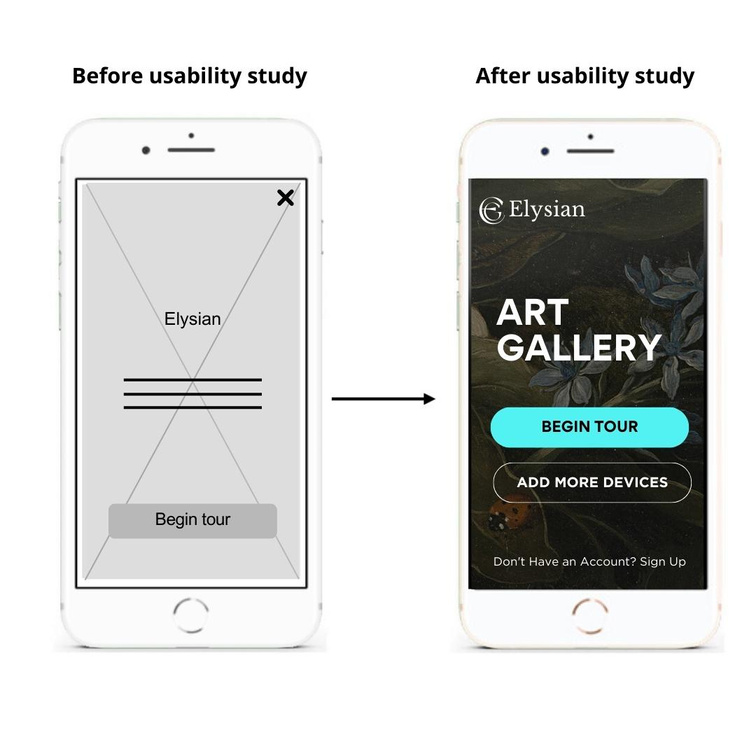
Because several users didn’t know that they could add more devices to a tour, or how to do it, I added a button to add more devices on the tour splash screen. This informed users that adding more devices something they could do earlier, before their tour began.
I learned from the second usability study that users wanted more information about how much time and how many rooms were left in their tour. They also wanted to be able to go to a previous room on their tour. I updated the tour page based on these findings.
Key mockups


High-fidelity prototype
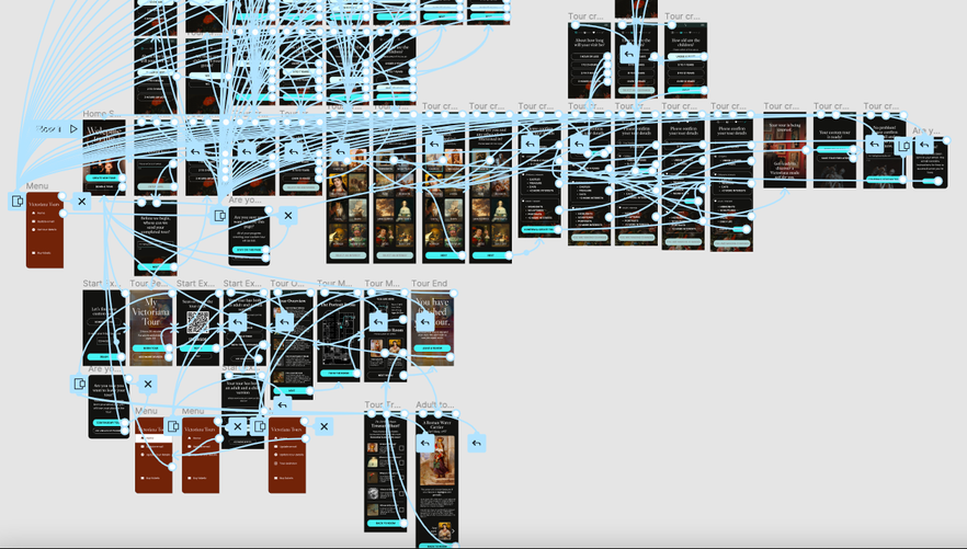
The completed high-fidelity prototype included two main user flows: creating a tour and going on the tour. It included one fully prototyped multi-select screen, as well as several partially prototyped ones.

Accessibility considerations
1
One of the main features of the app is making the tours accessible for all age groups. The children’s tour was designed as a treasure hunt with varying reading and difficulty levels
2
There are navigation redundancies throughout the app to accommodate several navigation styles. For example, accessing Home through the hamburger menu, or even by using the back buttons
3
The pictures and art are labeled for viewers with visual impairments. Each tour entry would include a visual description of the art as well as the usual history and context you would expect
Thank you for stopping by!
If you have any questions, would like to know more about me or have an interest in working together, please get in touch!
imen.nouisser@gmail.com
